Tips for Creating an Ombre Quilt

"Ombre" style quilts are some of my favorite. It's a fun way to squeeze a lot of colors into one quilt...while still maintaining a cohesive "look" and style. They're fun and wild, but also logical and sophisticated. At one point in my quilting journey, I thought that ombre quilts were too modern for me. However, after I've gotten some practice with finding what I like and what I don't like, I've found that these quilts are very "me." In fact, many of my quilt patterns are designs that are really great for ombre color palettes. I'll share a few at the end of those post. :)
Here is how I normally approach creating an ombre quilt:
- Decide on Layout
- Decide Color Scheme
- Fill in the gaps
I've had a few people ask if I use a color wheel or any sort of fancy formula to make sure that my colors look okay together. I do not. I am a firm believer that you can create gorgeous color palettes without the help of some scientific formula. Simply trust your gut and create something that you find beautiful. Here is my process for creating an ombre quilt.....
.
Decide on Layout
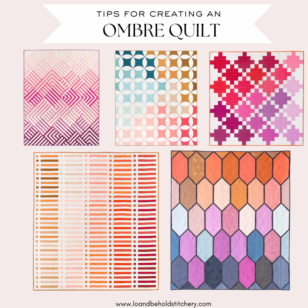
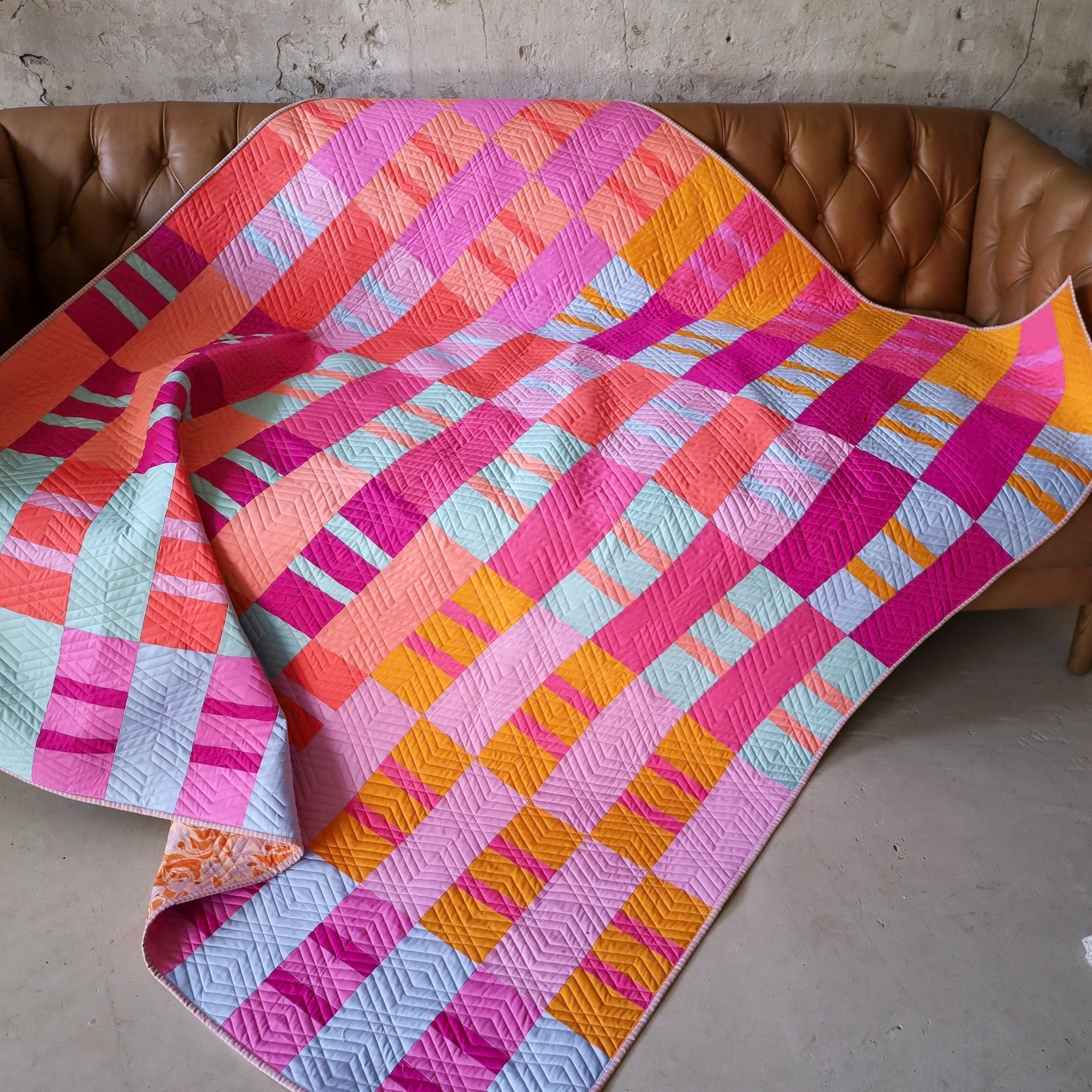
This tip might seem obvious, but it's a really good starting point for this process. For certain patterns like Interwoven and Shades of Citrus, your layout might be determined by the pattern. For example, Interwoven has a vertical fading effect, while Shades of Citrus has a sort of meandering/diagonal fading effect. With this knowledge, you can decide how you want those colors to appear within your quilt....ie certain colors at the top/center, etc. All Lo & Behold Patterns come with a coloring page and free digital coloring pages on PreQuilt , so take advantage of those! Even if you don't use colored pencils/markers, you can loosely label where you want each color to go. For a pattern like the Ombre Puff quilt, or even Celtic Crossing 2.0, you have free rein on your color layout! Personally, I love having diagonal movement in my quilt, so I try to do this as much as possible. This step happens very closely with the next step, so you might be making both of these decisions around the same time! Find some examples of Ombre layouts below.

.
Planning
On the topic of layouts, it can be SO easy to overthink what colors are beside each other in your quilt. Because of this, laying out your pieces prior to assembling your quilt top is a vital part of the process. Here are some tips for the planning process.
- Use a design wall - This is the design wall that I have, but you could also make one by hanging a piece of batting on your wall.
- Focus on blending colors so that there aren't stark differences. I always want a gradual change of colors, so this can mean mixing up colors more than you initially think to.
- Look at the layout in different lighting. Working in natural light is always best, if possible. This might mean if you initially layout your fabrics at night, maybe revisit them in the morning to make sure you still love your layout. If natural light isn't possible, something like a Daylight lamp is great for giving your bright, true-to-life color depiction.
- Take a photo - I like to sometimes look at my layout through my phone screen. This helps me see the overall "big picture" a little better. I'll also refer to it later and see if I still like where everything is or if anything needs tweaking.
- Come back to it. There's no rush. Tweak the layout as many times as you need to!
If you need a little inspiration, we have lots of beautiful fabric bundles in our shop!
.
Choosing Fabrics
Working backwards here, I think choosing fabrics is the trickiest for most people. Sometimes indecision comes into play and sometimes it's just hard to know where to start. I know that I can get hung up on decisions about color ALL THE TIME. However, when choosing fabrics for an ombre quilt, those always seem to be the easiest decisions for me. Here are five approaches that you can take:
- Full Spectrum Rainbow - This is the easiest. Choose traditional ROYGBV colors and you're good to go! One thing to keep in mind is to consider matching the saturation levels or tones....so either use all muted colors, all bright colors, etc. For example, looking at Art Gallery Fabrics solids by Suzy Quilts, there is a beautiful display of color, right? For the most part, we have all of the spectrum covered...and they're all dusty and muted and so so gorgeous together. It would look a little strange if there was a bright pink thrown in this mix, right? It just wouldn't fit. But a more muted, dusty tone would go with this bundle like peas and carrots! Its all about experiment and seeing what fits.

Check out our shop for some curated fabric bundles!
- An exception to this theory is when you hear people say "it just needs a pop of color". How do you know when to add a "pop" or not? Well, just my personal opinion here, but it depends on the pattern. If all of the fabrics are appearing evenly throughout the quilt, it might be distracting to have a pop of color. Because then they all of a sudden feel like they're competing. But if there's an accent fabric or a smaller amount of fabric, maybe that's a good place to introduce something different. This can sometimes mean doing a bright neon binding or accent cornerstones.
Jodie of Joz Makes Quilts created an Ombre Puff quilt using a more saturated Rainbow approach. You can see that the shades of colors are all similar. It's bright and happy and screams summertime....I love it!

- Monochrome - Okay I lied, maybe THIS method is the easiest. Choose one of your favorite colors then expand on that color by adding various shades. For this Church Window quilt, I used the Kona Color of the Year for 2019 (Enchanted) and created a sort of art deco/mermaid vibe by adding lighter shades of green. I distinctly remember choosing colors for this quilt. I walked a fine line between choosing true greens that were more cool than warm. Essentially, I was careful not to get too close to aqua and go more in the mint direction. You can read more about this Church Window quilt on this blog post.

.
- Three-Tone - This is my FAVORITE method. I use it all the time! Start with 2-3 colors as your "anchor points." They can be seasonal colors, your favorite colors, or anything else that you might be inspired by. I've found that if I use more than 3 colors, I start to stray from my aesthetic. This is where personal preference comes in. I know many quilters that use a wide range of colors and their quilts look great. For me, the sweet spot is keeping my color ranges compact and minimal. Experiment and see what you prefer! Once you have your colors, think about how you can add other shades to make those colors "fade" into each other. This means playing with saturations and values of that shade. For example, in my Ombre Puff Quilt seen below, my 3 anchor points are plum, pimento and caramel. Then, I expanded on those colors so that they created a gradient. This included adding some peaches, creams and corals. Now, all of my fabrics fade in and out of each other, which creates a soothing palate that always keeps your eyes moving.

.

.
- Find ideas on Pinterest - Pinterest really is a great place for finding color inspiration. You can search things like "autumn color inspiration" or "vintage color palette" and you'll have hundreds of results to search through! If you're looking for a place to start, I have a Pinterest board specifically for my favorite color palettes. here are a few examples:

.
- Refer to swatches and color cards - This might seem obvious, but color cards and swatch books are normally organized by color. So say that you want to create a blue and pink ombre quilt, simply look at the line of blues and pinks and choose sequential colors that are pleasing to the eye. Personally, I cut up my Kona swatch card so that I can rearrange certain colors and play with various combinations, but having the colors in order is also extremely beneficial. If you sew with solids, I HIGHLY recommend investing a swatch card. Most fabric manufactures have them for their particular line of solids. We have Kona cards in our shop!

If you want to turn your swatch card into a magnetic board, check out this blog post!
.

.
Fill in the Gaps
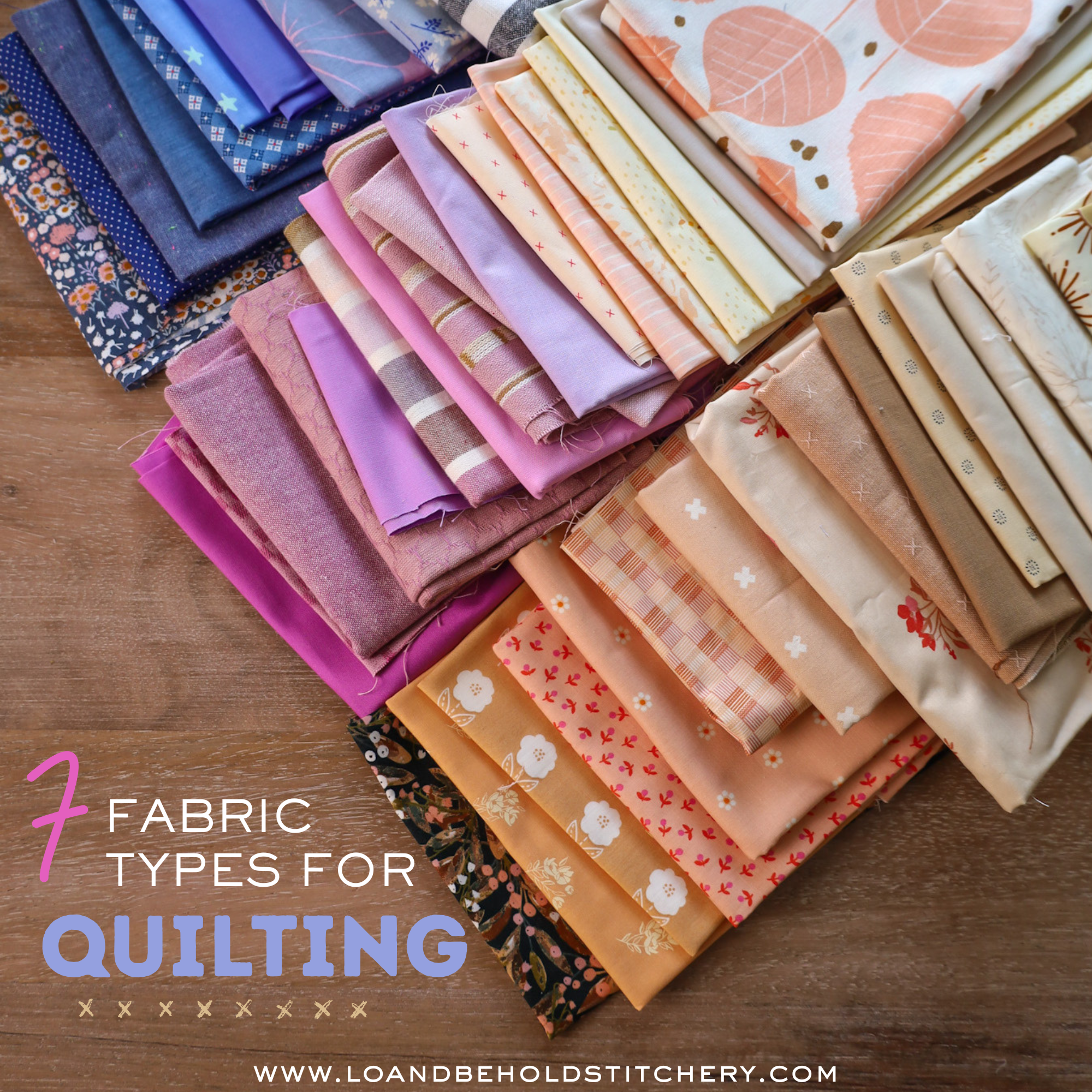
This step is really important! Once you choose your fabrics, you'll want to take a step back and look at everything as a whole. Depending on how many colors you are using for your quilt, you may or may not want the ombre effect to be intricate and dense. For example, if you are using solids, you might want a wide range of various solids so that the quilt looks cohesive and "seamless". Play around with adding extra fabrics until your bundle has the look that you want. I generally like to put my fabric in a certain order so that I can see if there are any gaps. For example, start with the darkest shade of one color and arrange those shades so that they fade into the next shade. This generally means that like colors will be next to like colors.

.
Using Prints
If you are using prints, or even a mix of solids and prints, then I like to consider the scale of those prints. I try to achieve an even mix of small, medium and large scale prints, just to add interest. This can also help contribute to the ombre look of your quilt.
Using various scales of fabric adds depth and interest so that your eyes have a place to rest. Using fabrics that are all the same scale can make your quilt appear either too busy, or not interesting enough. Keep in mind the finished size of the blocks for what ever you are creating. For the Ombre Puff Quilt, the squares will finish at 3.5", so if you use something that has a lot of negative space, or an enormous print, that might get lost in your square. This isn't necessarily a deal breaker, but it's something that you'll just want to keep in mind. :) I used a few larger scale prints in my Ombre Puff quilt and I actually really like the interest that those prints add.
.

.
In this Triangle Fade quilt, I used a mix of solids and various scale prints. In some of the triangles, you can see a big portion of the fabric, while other triangles show only a smaller portion of what the fabric looks like. There is also a mix of directional fabrics (the stripes) and non-directional fabrics (the flowers or polka dots). With a quilt like Triangle Fade or Ombre Puff, I feel like this really helps add some character to the quilt. For other patterns like Interwoven or Shades of Citrus, using directional fabrics may be distracting. Essentially, if I know that I can rotate my pieces before I sew them together, then I feel comfortable using directional fabrics.

.
Practice
The last tip is to simply practice. As you choose fabrics for more and more quilts, you'll start to become more and more comfortable with the process. Everyone has different tastes and opinions of what looks beautiful, so I really think it's a matter of practicing that skill and honing in on what you love.
I hope this gives you some insightful tips about what goes into creating an ombre-style quilt. Remember that here is no right or wrong way to create a quilt that you love. Loosen up and have fun with it! If you are looking for a quilt pattern to create an ombre quilt check out the following patterns:
- Scrappy Windows (free!)
- Ombre Puff (free!)
- Patchwork Squares (free!)
- Shades of Citrus
- Triangle Fade
- Interwoven
- Rhythm
- Celtic Crossing
happy quilting!
Brittany
.


