Choosing Colors for Petite Plaid

The Petite Plaid quilt pattern uses color to create the illusion of stripes blending together as they intersect — pretty fun, right?! The magic really comes down to your fabric choices, so let’s walk through some helpful tips to get you started.

Petite Plaid’s design is built around 10 colors:
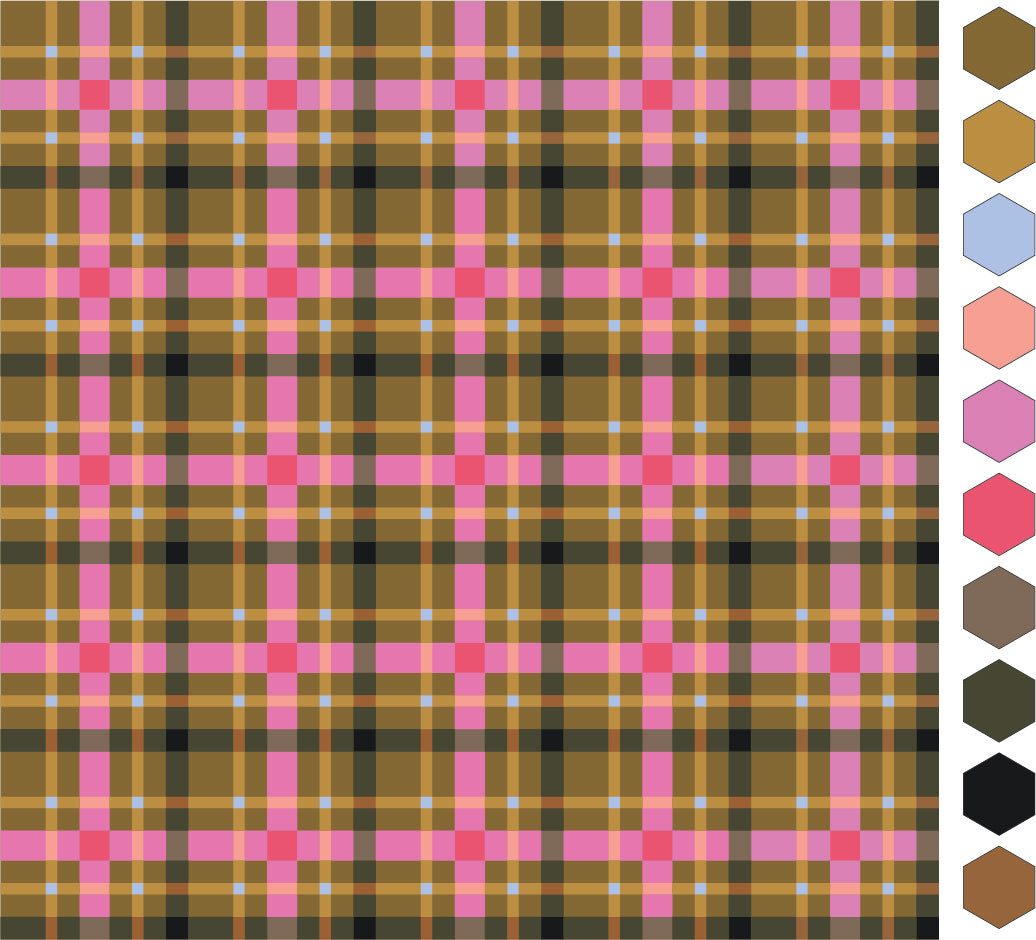
- Background (BG): This is the predominant color of the quilt and really sets the stage for the design. For the cover quilt, we used a warm, earthy neutral.
- A1–A3 (Accent Stripes): The “A” stripes are the narrowest and play a supporting (but still important!) role in Petite Plaid’s design. Choose colors that coordinate with your Background, B1 and C1, but won’t steal the spotlight. In the cover quilt, we used a lighter, brighter shade of the Background color — noticeable, but in a complimentary way. We also added a fun pop of color for A2, which we'll share more about below!
- B1–B3 (Bold Stripes): The “B” stripes are the widest stripes and where your eye is drawn first. They take center stage in this design and bring the biggest impact. Choose colors that stand strong against the Background and coordinate with the A and C stripes. For the cover quilt, we chose a bright, vibrant, splash of pink — a complementary color to the Background — which adds a bold pop while still playing nicely with the other hues.
- C1–C3 (Co-Star Stripes): The “C” stripes are a medium width and tend to be what you notice after the bold B stripes. Choose colors that work well with both the Background and A stripes, since they share the spotlight with B. In the cover quilt, we went with a dark green — a darker version of the Background — to add contrast while keeping harmony.
Now that you’ve met the colors, let’s dive in and choose fabrics!

Background (BG), A1, B1, C1
Do you already have an idea of the colors you’d like to use in your quilt? If so, start by choosing your colors for the Background, A1, B1 and C1 first.
Not quite sure yet? No worries — here are a few questions to help get the ideas flowing:
- Who is this quilt for? What are their favorite colors?
- What’s your inspiration? (Pinterest is always great for gathering ideas and photos.)
- Where will the quilt be displayed? What’s the color scheme of that space?
- What mood or look would you like to create — earthy, classic, bright, playful, neutral, soft, calming, monotone, energetic or something else?
- Do you prefer high-contrast quilts, or something softer and more subtle?
Once you’ve thought through these questions, you’ll be ready to choose your colors for the Background, A1, B1 and C1.
By the way — we’ve included a “Plan Your Quilt” sheet and fabric labels in the pattern to help keep your project organized. It’s a simple way to track all the little details as you go!

A2, B2, C2
Now that you have the Background, A1, B1 and C1 selected, next choose your colors for A2, B2 and C2. Before deciding, though, notice how each set of stripes blend together where they intersect? This is what creates the illusion that the stripes are woven together.

We’ve created a simple formula to help you choose the intersecting colors — think of it like “adding” two colors together to create a new one. It’s a bit like mixing paint! 🎨
For each main color (A1, B1, C1), “add” it to itself. Then, select a darker or lighter shade from the same color family to become A2, B2 and C2.
In reality, doubling the same color would just give you the same (or a darker) shade. But for our quilty purposes, you get to have fun! Pick a lighter or darker version of A1, B1 and C1 to create their matching pairs or choose an unexpected bright pop of color like we did with the blue we used for A2!
- A1 + A1 = A2
- B1 + B1 = B2
- C1 + C1 = C2

A2, B2, C2 QUICK TIP: If you want to add a pop of color and a fun twist to your quilt by using a color for A2, B2 and/or C2 that doesn’t follow the above formula, you will still have the illusion of "plaid". In the example above, A1 + A1 would not equal any shade of blue (Forget-Me-Not), BUT, it adds a hint of cool that offsets the warmer colors that we just love!
A3, B3, C3

The last group of colors you’ll choose are A3, B3 and C3. As with the other stripes, pay attention to how each set blends where they intersect. This time, two different colored stripes meet (unlike A1, B1 and C1, which were the same color), creating a third color — a combination of the two.
To achieve that signature woven effect, A3, B3 and C3 should reflect a mix of the intersecting colors and have similar values. These stripes are usually more subdued. For example:
- A3: We chose a slightly brighter shade than A1, with a value similar to B1, resulting in a peachy color you might expect from mixing pink and yellow.
- B3: Since pink and green combine to make a purplish brown, we selected a warm brown tone with a value between the two colors.
- C3: This color and value sits between A1 and C1, representing a combination of the two if they were mixed.
Here’s the formula:
- A1 + B1 = A3
- B1 + C1 = B3
- A1 + C1 = C3
Important: Following this formula for A3, B3 and C3 is key. If the colors contrast too much or are too different, it will “break” the illusion — the stripes will lose their woven effect and instead appear as individual blocks.
These carefully chosen combinations help Petite Plaid maintain its harmonious, woven look.
Here are a few colorway ideas to get you started:

USING PRINTS WITH PETITE PLAID
Petite Plaid also works well with small prints and blender fabrics. They're a great way to add a bit of texture and movement to your design!

Fabrics shown above: PRINTS (Delicate Balance Evergreen, Drifting Sprig, Pretty Paper Crimson) and SOLIDS: (Fresh Sage, Sprout, Sandstone, Teak, Cinnamon, Weathered Brick and Potters Clay). Prints by Sharon Holland release April 2026. All fabric by Art Gallery Fabrics.
Tips for working with prints
Petite Plaid is made up of small pieces, so choosing the right fabrics can make a big difference. Here are some helpful tips:
- Blender prints: Blender prints typically have a lot of background space with a small repeating motif in one or two colors. Since blenders read similar to a solid, they are perfect for adding subtle texture.
- Small-scale, dense prints also work well: Prints with a heavier density add texture and movement, making your quilt more visually interesting. They're small enough that their design doesn't get lost with the smaller piecing.
- Use non-directional patterns: Small, non-directional repeats work best so that the pattern looks good no matter which direction each piece is placed.
- Avoid medium- or large-scale prints: Because the pieces in Petite Plaid are small, medium or large prints can lose their design and become unrecognizable in the finished quilt.
- Balance prints with solids: Consider using 1–3 prints and filling the remaining colors with solids. Prints add texture and movement, but using too many can cause unrest. Using ample solids keeps the overall design balanced.
DESIGN YOUR PETITE PLAID QUILT
Fabric requirements
The Petite Plaid pattern includes 12 sizes from Pillow to King - which size are you making?

Testing colorways
Now that you’ve got some ideas, it’s time to play! Try out different color combinations to see what speaks to you and what will make your Petite Plaid quilt shine.
We’re excited to share that we’ve partnered again with PreQuilt to bring you free, interactive online coloring pages. These make it super easy to experiment with fabric color combinations quickly! You can digitally plan this quilt — or any Lo & Behold Stitchery pattern — with just a few simple clicks.
- The free option lets you mock up different brands of solids.
- You can upgrade to include prints, save your designs and more.
- Use the code LOANDBEHOLD for 20% off your annual subscription (Basic or Market).
Quilt Kits
If you decide that you just want to get started on your very own Petite Plaid Quilt, We have five Petite Plaid quilt kits in the shop…and this time, we’re offering them in some different sizes:
- Cover Quilt (throw)
- Nutmeg version (lap or table runner)
- Spiceberry (lap or table runner)
- Sugar Plum (small throw)
-
Wintergreen (large throw)
The following online shops also have kits!
Have fun exploring colors, and don’t forget to share your creations! We love seeing your quilts — tag us at #petiteplaidquilt #loandbeholdpatterns and @loandbeholdstitchery.
Happy quilting! 🧵
Questions? We’re here to help — email us anytime at hello@loandbeholdstitchery.com


