Upscale Plaid Quilt - the Duval version

I have a really fun and unique quilt to share with you! Upscale Plaid quilt pattern is one of our most loved patterns in the Lo & Behold collection. It must be the versatility, layout options or lots of different sizes to choose from! For me personally, it's definitely one of my favorites, simply because each version that I make looks SO different from the next. And it's quite fun to create (if I do say so myself).

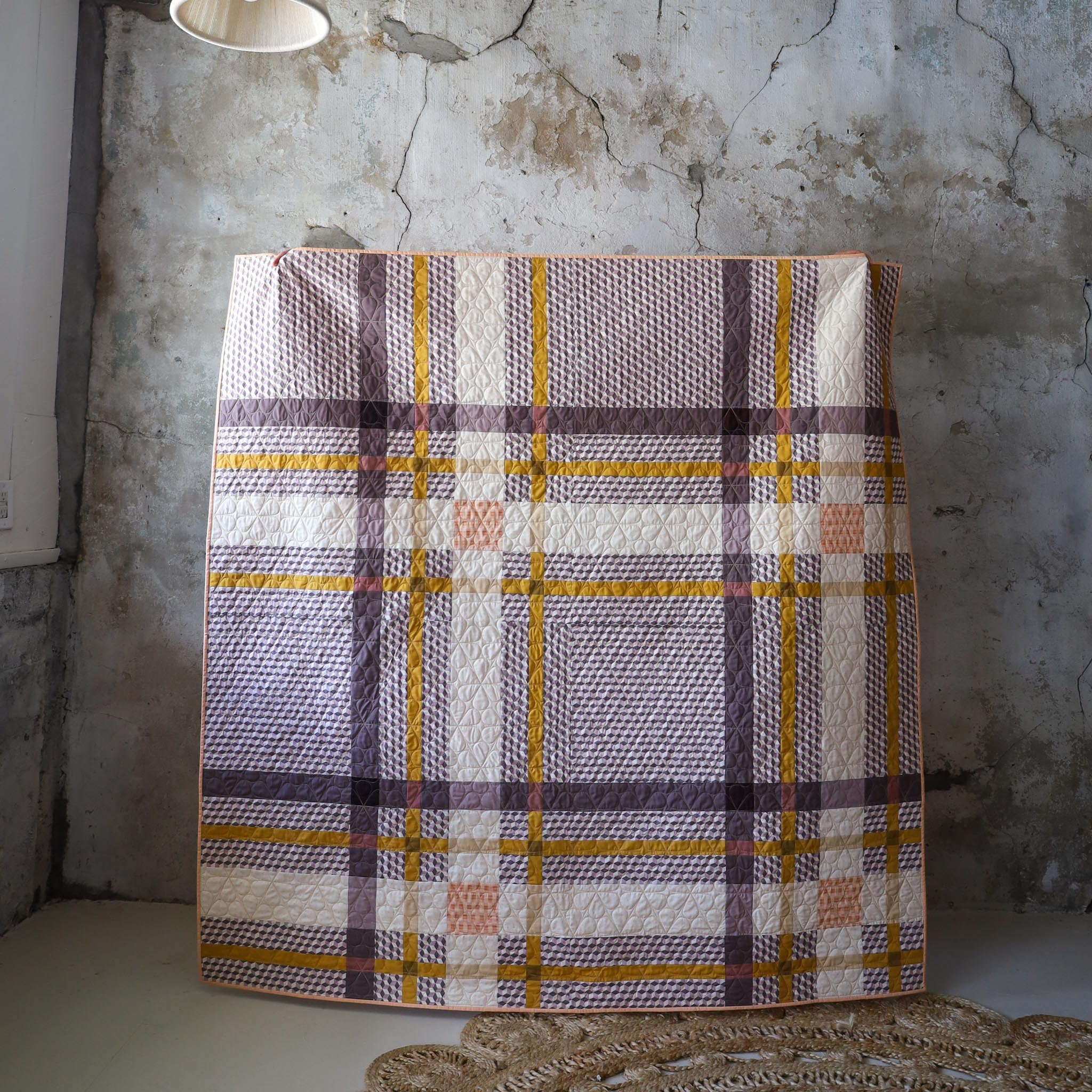
Since this pattern has 5 different layouts, it's always fun to see how the mock-ups look. I decided to go with the "cover quilt" layout...my favorite!
When we released Upscale Plaid, we also shared a blog post about tips for choosing fabrics for this quilt. If you haven't already read that post, be sure to check it out here...it's really informative!
One thing that the blog post touches on is using prints for Upscale Plaid. Well, I wanted to push the envelope and test out that theory. But I'm really taking a "risk" with this one because not only did I use a print for the Background fabric...it happens to be a geometric print! *gasp!*

I know, I know. I have the same questions you have. Would it be too busy? Would the print line up in between the seams? Would this be an epic fail?? Haha. All valid questions.
Since the print is the Background fabric and the majority of the quilt, I decided to use mostly solids for the rest of the fabrics. I also used a low-volume, subtle print for one of the stripes, and an "accent" print for one of the stripes intersections. So in total, there are three prints and the rest are solids.

All fabrics are Art Gallery Fabrics:
- BG - Blocks Haze
- A1 - Driftwood
- A2 - Truffle
- A3 - Thistle
- B1 - Honey
- B2 - Golden Bronze
- B3 - Vanilla Custard
- C1 - Tiny Moon Pearl
- C2 - Basket Weave Shrimpy
- C3 - Potters Clay
We have kits for this quilt in the shop!
Generally speaking, it's really important to cut your WOF strips "on-grain". But with this quilt especially, with a geometric fabric as the Background, it was pretty crucial that my strips were as straight as possible. If you need tips for cutting WOF strips, be sure to check out this blog post.

Another thing to point out with this fabric is that it is ever so slightly considered a "directional" print. Meaning that if you rotate the fabric 90 degrees, you can tell that the print has been rotated. A good example of a directional fabric is a stripe or fabric with something like trees on it. You'll notice if those fabrics are rotated 90 degrees. If the stripes are rotated 180 degrees, it'll be identical; but if the trees are rotated 180 degrees, they'd be upside down. This is always something I think about when using prints. For certain quilt patterns, it makes a big difference; for others it doesn't. It's just something to be aware of. :)
This fabric is a little tricky. I first I didn't think it was directional but after close inspection I noticed that it definitely was. So I was left with two choices...do I pull my hair out and try to hack the pattern so that all of the pieces in the quilt are cut the same exact way? Or do I cut out my pieces as is and whatever happens happens?
I opted for the latter, simply because I wanted to see how it'd turn out. I felt like this fabric was already a little bit risky, so why not push the envelope and let it play out as-is?


I sent this quilt top to Sara of Stitch Lab Quilting and we picked out the Daisy May pantograph by Digital Longarm for a mid-century modern look and a tan thread so that it blended nicely with all of the fabrics.
Overall, this quilt turned out more beautifully than I could've ever imagined! I had my hesitations at the beginning, but I'm so glad I went all in. It has warm, velvet-y, twead-like, mid-century modern vibes and I absolutely love it! The solids are moody and all play well together. The Background fabric gives the quilt a texture that doesn't seem like it should be quilting cotton. Plus, since all of the fabrics are from Art Gallery, they're silky smooth and all come together so luxuriously.


As for the Backing, I decided to introduce another color to this palette. It's another fabric from the Duval collection called Boho Birds Snapdragon. These birds are just the cutest and really contribute to the mid-century vibe. The binding is one of Suzy's new solids for AGF called Snapdragon. I felt like the lighter peach was needed as an accent that stood on it's own. It also highlights the backing fabric which I love. We have optional Backing/Binding add-on with the quilt kits in the shop!


Circling back to the conversation earlier about my fabric questions with this Background. If you look really closely, you can see the seams, sure. But overall, I was really surprised with how it all came together. I am SMITTEN!


LINKS:


