Pansy Patch Quilt Pattern - The Cover Version
Usually I share all about the cover quilt on the same day we release a quilt pattern…but for our latest pattern release, we wanted to give the cover quilt a little more time to shine on its own. So today’s the day, and I’m so thrilled to share all about the Pansy Patch cover quilt!
The Pansy Patch quilt pattern so far
Pansy Patch is the 31st Lo & Behold Stitchery quilt pattern, and I think it’s the perfect addition to our lineup. The charming floral design fits right in with patterns like Knitted Blooms, while the extra negative space gives Pansy Patch its own unique (and block print-esque) look.

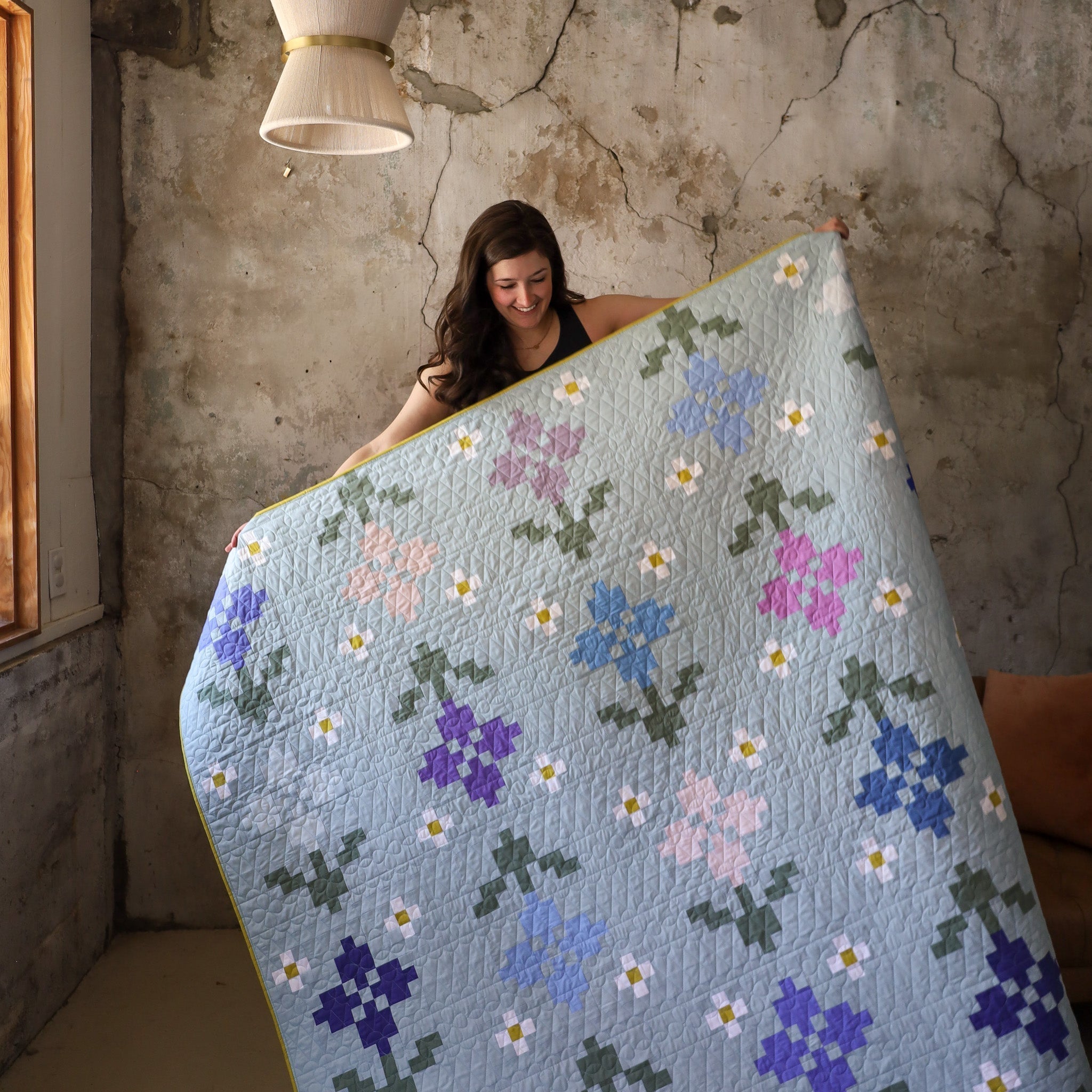
The Pansy Patch pattern includes three different colorways: Modern, Patchwork, and Traditional. I’ve sewn up samples for all of them, though so far I’ve only shared the Forget-Me-Not version. Today’s quilt is another Modern version, just like that one…but with a completely different vibe!

You might even remember that I originally wanted the Forget Me Not version to be the cover quilt. As I pieced it, though, it didn’t feel quite right.
Choosing the cover quilt for a pattern always feels like a big decision! The cover quilt becomes the face of the pattern, and it has to represent the pattern’s inspiration and overall vibe. So maybe it’s not surprising that sometimes it’s hard to nail down just the right fabric pull, even if I have ideas from the early design stage. For Pansy Patch, I was torn between light and springy (which seemed perfect for a floral quilt released in May) and dark and textured.

I started off sewing the light and springy palette (which became the Forget-Me-Not version), but I couldn’t stop thinking about the dark and textured option. I finally realized that was the version I really wanted to represent Pansy Patch…and so the Pansy Patch cover quilt was born!

My Cover quilt sample
I made the Pansy Patch Cover in a large throw size (75” x 80”), which gave me twenty-five blossoms on my quilt…perfect for showing off the floral motif!


Like I said, I realized I wanted something darker, moodier, and more textured. I just had to find the perfect pull…and I think I did! I’m seriously obsessed with every single fabric I picked. Buckle up, because I’m going to nerd out about fabric colors for a minute! 🤓
FABRICS
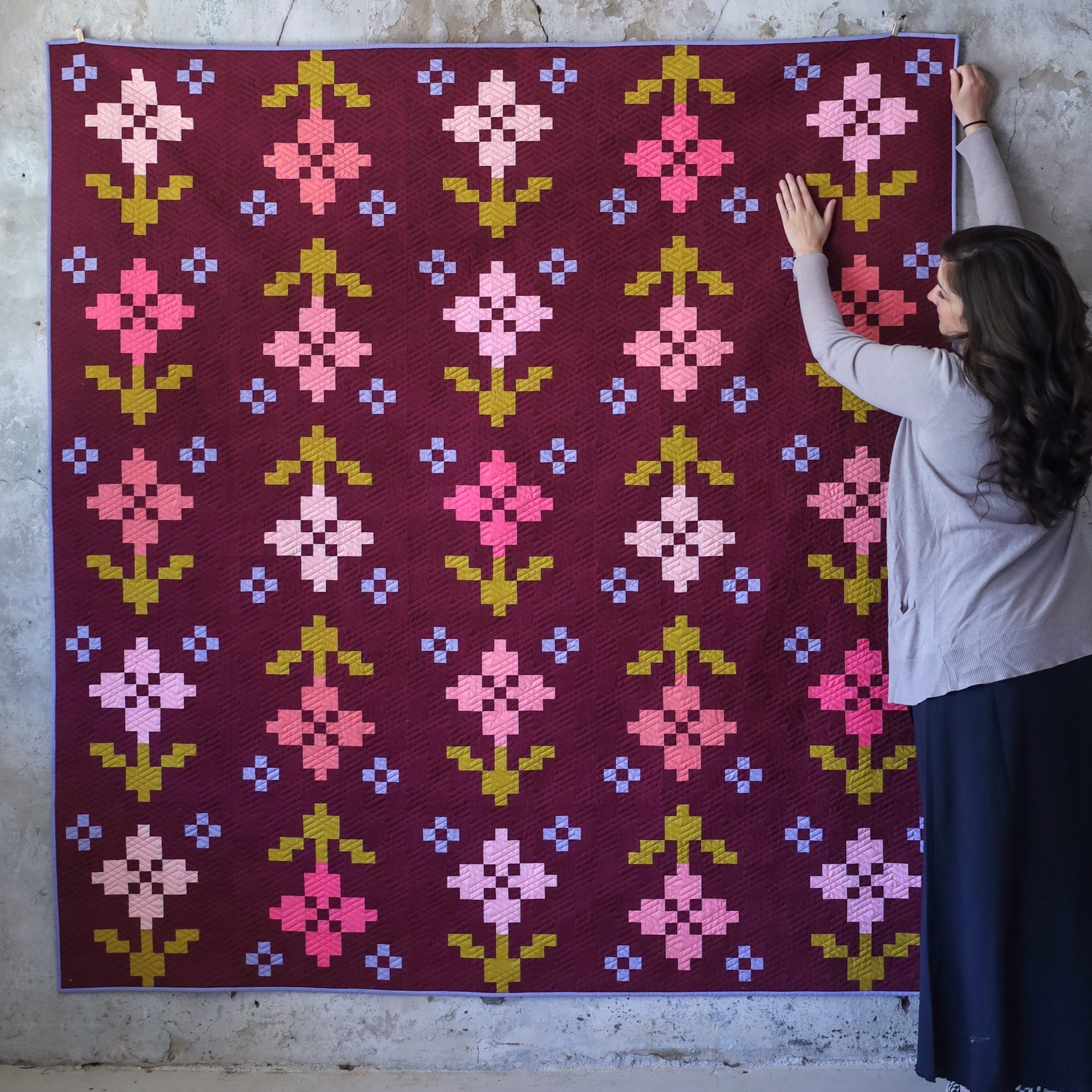
While I was tempted to go with a medium or dark green background, I’ve actually made quite a few of those kinds of quilts recently (like Rosemary Knitted Star, Cover Knitted Blooms, Clover Ruby Sue…even Cover Petite Plaid uses Forest Night!). I decided to go a completely different route for this one. I steered clear of greens, and instead I picked a new background color I’ve never used before…Velvet! (All top fabrics are Art Gallery Fabrics PURE Solids.)


I’ve always loved this fabric, a rich reddish brownish purple. As soon as I began mocking up my quilt with Velvet, I just loved what it did to the overall mood of the quilt. I’ve been really leaning into dark, warm tones for our home decor, so this felt like exactly the kind of quilt I would truly use to decorate our living room…which is perfect, because I designed Pansy Patch to evoke feelings of nostalgia and cozy spaces, with the embroidery-esque flowers.

I was sold on Velvet, but I still had to figure out my flowers. For this version, I realized I didn’t want too much variation between the colors (unlike the Forget-Me-Not version, where I use over a dozen flower fabrics). I stuck to five flower colors:
- Cactus Flower
- Crystal Pink
- Miami Sunset
- Quartz Pink
- Silk Ribbon
These fabrics have fairly similar values. That subtle variation gives the quilt a slight twinkle effect instead of calling attention to each individual flower…and of course, it lets that gorgeous Velvet background shine.
For the stems and leaves, I used Aurus. It’s a nice, saturated green…I might even call it a muted lime! By itself, it behaves more like a yellow. But once I paired it with the Velvet, those purple undertones made Aurus look more green. (It’s always so fascinating to pick colors individually and then put them side-by-side. They often take on a life of their own!)

All I had left was the accent flowers…and I had the hardest time finding the right look! At first, I started making them with a white outer and yellow inner (just like the Forget-Me-Not version). Once I’d sewn up a few, though, I felt like they distracted too much from the main flowers…and they just made the quilt look too warm overall. It was back to the drawing board.
As I noodled, I thought back to the Ruby Sue cover quilt. I loved that light blue color paired with a darker purple. Maybe Hydrangea and Atmospheric for the outer and inner parts, respectively? I started sewing them…and very quickly realized they were even more distracting than my original choice. They even made the quilt feel like less of a cohesive whole.

At the time, I had a range of blues and purples left out in the studio (from auditioning fabrics for the Forget-Me-Not quilt). It just so happened that Intergalactic was on my table…and it ended up being the happiest accident. I couldn’t get over how it looked next to Velvet!
I never would have picked Intergalactic on purpose, because on its own it reads like a blue with hints of purple. I would have just gone with Atmospheric or Forget-Me-Not instead! But when I saw Intergalactic beside Velvet, it looked like a light blue. Seriously, it’s WILD how much this fabric changes depending on what it’s next to! I kept checking the color swatch over and over to make sure I didn’t accidentally grab one of the blues…but no, it was Intergalactic.
I think it works so well because it’s a dusky purple that reads like a blue against Velvet. It's like there's a slight friction that does exactly what that little flower is supposed to do: act as an accent.
That left me with one last problem: What color should the center of the accent flowers be? Nothing I played with felt quite right. They all took away from the magic of Intergalactic.
The solution finally hit me: why not let the center match the background color? Then it would mimic the center of the main flowers and allow Intergalactic to shine in those little nine-patches. I tried it, and sure enough, it was perfect! Velvet was the answer.

You know, normally I try to stick as closely to the pattern and fabric requirements as possible. In the Modern version of Pansy Patch, you’re supposed to have an Accent Outer and Accent Center…but for this version, I broke the rules just a little bit, and I think the end result is totally worth it! As I’ve said before, Pansy Patch has so much potential, and I can’t wait to see your own little tweaks and hacks.
Overall, the cover quilt feels warm and just a smidge unexpected (especially for a springtime flower quilt!). At the same time, it feels like this is the quilt I’ve always needed, and my brain secretly knew that. I spent a long time really nailing down every single color for this quilt, and I couldn’t be happier with how it turned out.
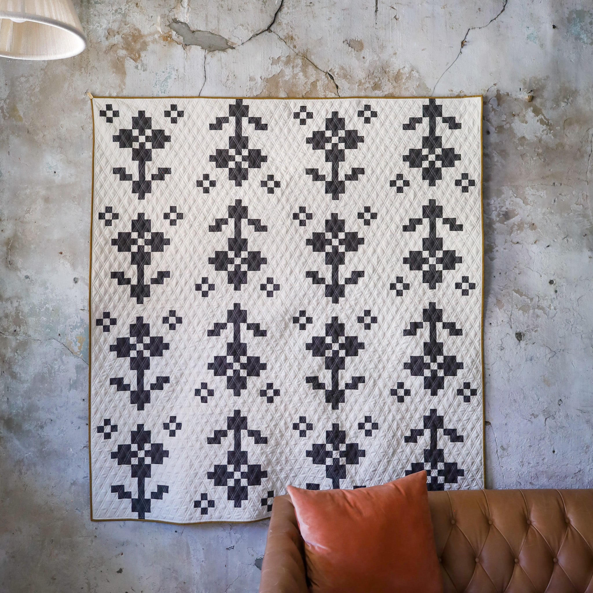
I also love how it works together with the other Lo & Behold Stitchery cover quilts! I think of them as their own quilty family, and I want every cover quilt to be unique but still fit in with the other covers. This is the 31st Lo & Behold cover quilt (or 35th, if you count retired cover for re-released patterns), and I think it really does fit in so perfectly with the rest.

This quilt took a lot of brainstorming, trial and error, and even a little magic…and I’m so happy it’s the face of our newest pattern!

(Yes, we do have quilt kits in the shop for this version, so you can experience the magic yourself!)
BACKING, BINDING, AND QUILTING
After the journey that was figuring out my fabric pull for the quilt top, the rest of the cover quilt came together so easily.

I picked Wild at Heart Amber for the backing (from AGF’s Bloomcore collection). I love how it’s a lighter print, which adds a fun contrast to the dark solids of Velvet, but it plays so nicely with the stems and pink flowers.
For the batting, I picked a wool/cotton blend…which is a first for me! I really like it. It feels pretty comparable to cotton batting, but with a little more loft and fluff…which makes it great for showing off quilting.


I sent this one to Trace Creek Quilting for longarming. While I was tempted to go with a floral pantograph, I decided to play up the negative space and that wonderful background color with something that would really shine (and not just echo the flower piecing).

We landed on the Diamond Drift panto from Longarm League. It mimics a kind of velvety texture, which really plays up the Velvet background. We used a medium pink thread for the quilting, so the quilting doesn’t disappear into the background, but it doesn't draw too much attention to itself either.

Finally, for the binding, I knew I had to go back to Intergalactic to get more of that color in the quilt. It’s the perfect finishing touch to this gorgeous quilt.


Make your own Pansy Patch quilt
Seeing this Pansy Patch cover quilt come together was just the best kind of quilting experience…and that’s what I want for you too! I hope you’ll play with and love this pattern, just like I have.


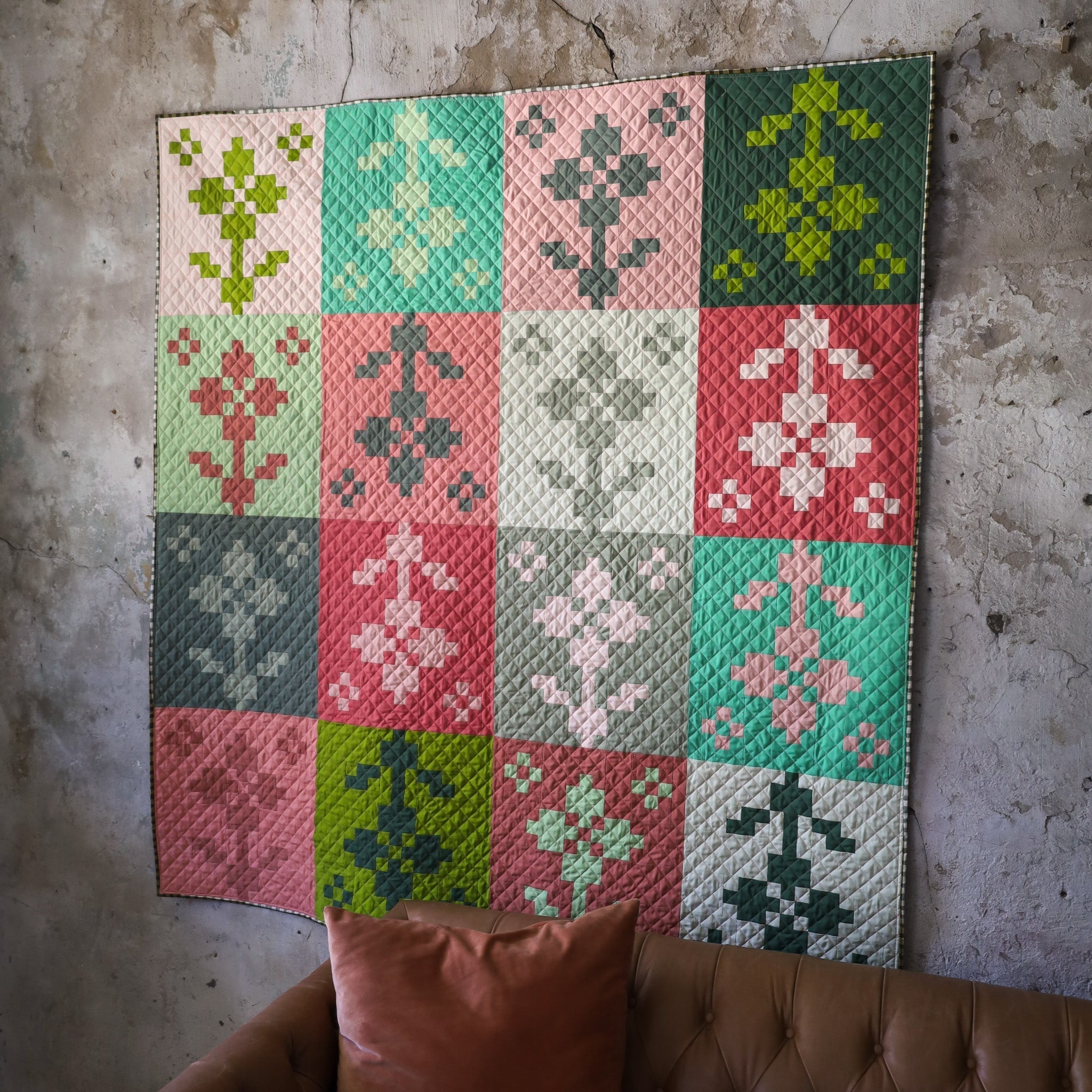
The quilt I just showed you uses the Modern colorway from the Pansy Patch pattern, with fat quarters for flowers. You can get a really different look by using fat eighths or yardage for flowers...or by using one of the two other colorways!
QUILT KITS
We have quilt kits for this version in the shop, along with three other colorways:
- Forget-Me-Not, with sweet, springy blues

- Sprout, for a fun mix-and-match look

- Lava Rock, a classic, bold two-color option

DESIGN YOUR OWN
With three different colorways (plus plenty of opportunities for breaking the “rules”), you can get so creative with Pansy Patch! Find the digital coloring page on PreQuilt, or print off some of our free quilt coloring pages. Maybe you’ll end up experiencing some color-picking magic too!


Happy quilting!
In case you missed it…