How to Choose Fabrics for Getaway

Choosing colors for a quilt can be a lot of fun but it can also be stressful - with the cost of fabric plus the time needed to make a quilt you want to love the end result - so how can you make sure that the colors you chose will actually look great together as a finished quilt?!
Most of us have been there, we love the fabric we picked out, I mean they really do look great next to each other and we're excited to get started. But somehow after all of the cutting, piecing, pressing, and sewing, when we finally see the finished quilt top we're left feeling... well, a little underwhelmed. How is that possible?
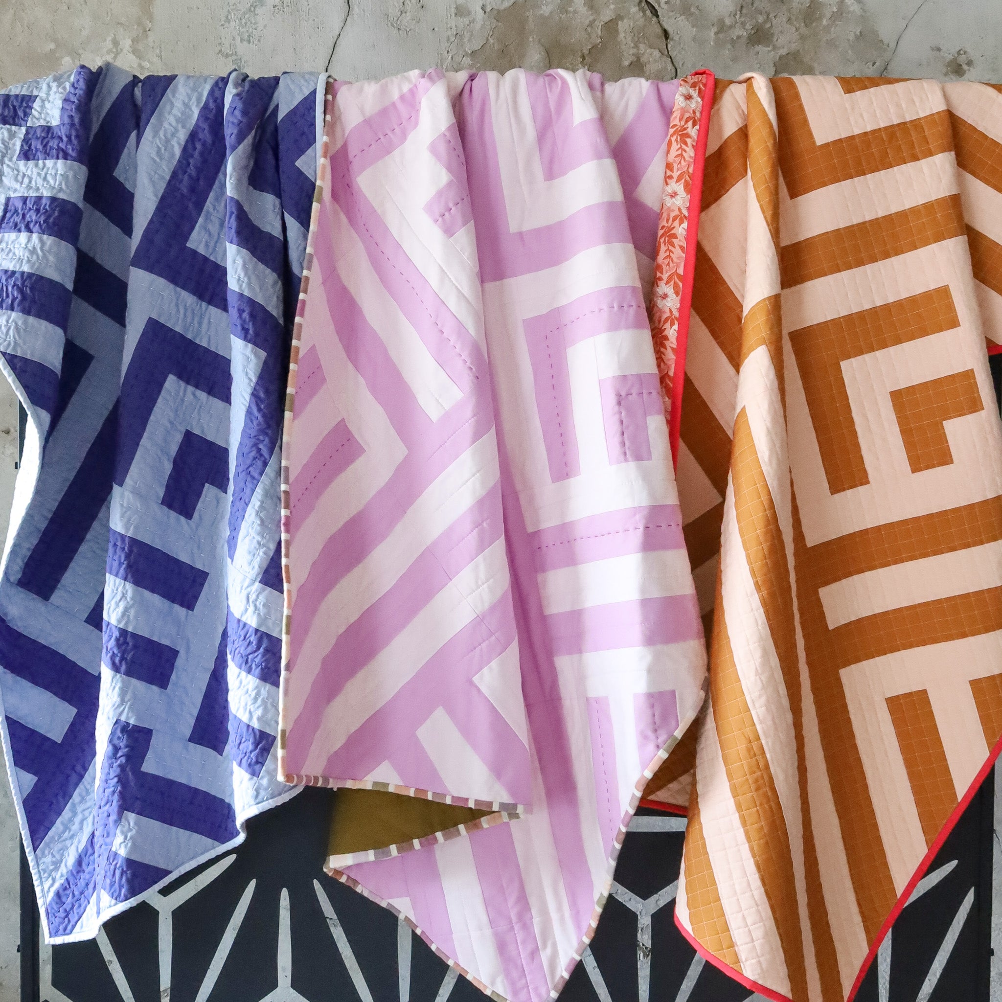
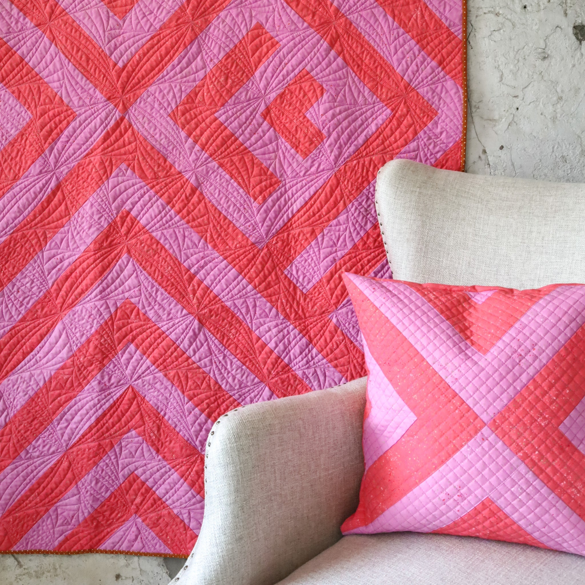
If you've ever felt that way I've got a bit of good news for you, Getaway uses just TWO colors. You're starting off in a great place! And if a few tips on choosing colors would be helpful then read on, I've got a few color scheme ideas for you!
MONOCHROMATIC
A monochromatic color scheme uses just one single focal color along with its tints and shades. Although that may sound, dare I say boring, quite the opposite is true. Monochromatic palettes can create a wide range of colorways that go from calming to bold!

Lets test it out. First choose a focal color. For this example I'm using a midrange pink/purple, Gumdrop, which is outlined in black on the color strip. All of the other colors we choose will be a variation of Gumdrop. Next, choose 3 lighter tints and add them from lightest to darkest to the left of Gumdrop. Then, choose 3 darker shades and add them from lightest to darkest to the right of Gumdrop. This gives us a total of 7 colors to work with.
Couple of notes:
- You can create palettes with any number of colors. I typically start with 2-3 times the number of colors I want to end up with. I like choices!
- When choosing your colors make sure there is enough difference between each color to create a noticeable shift.
- Most fabric manufacturers list solids from light to dark giving you a range of options to choose from that are already shown in order - no special arranging needed!
Monochromatic palettes can be: low, medium, or high contrast.
Low contrast: pairs the lightest colors to the left of the palette together to make subtle, soothing combinations.

Medium contrast: use the more vibrant, saturated colors in the middle of the palette to create bright and cheery combinations.

High contrast: uses one color from both the left and right of the palette to create bold, striking colorways.

COLOR TEMPERATURE
Another way to create interesting color combinations is by incorporating temperature. Colors are often referred to as "warm" or "cool". This refers to whether a color lies on the red/orange/yellow or "warm" half of the color wheel or on the blue/green/purple "cool" half of the color wheel.

Warm Colors
When pairing the focal color with warm colors it turns into a bit of a chameleon and appears cooler and lighter or darker than it actually is. When Gumdrop is paired with peach it appears to be lighter but when paired with roasted pecan it appears darker. Notice how it also appears cooler than the warm colors its paired with, pretty "cool" right?!

Cool Colors
A similar thing happens when we pair the focal color with cool colors. See how it appears to be lighter when paired with aqua and darker when paired with dark blue? These cooler colors also make Gumdrop feel warmer than it really is!

Test this out with any warm or cool color combos to see how your focal color reacts to those its paired with, temperature really helps create color combinations that pop!
BLACK & WHITE
Another great option for creating a two color palette is pairing your focal color with a variation of black or white. To add a richness to your palette, instead of using pure black or pure white, replace them with colors that are a very similar in value but have just a bit of color included. Think dark, rich jewel tones for black or the very lightest, most pale of colors for white. Although the shifts in color are subtle the undertones will add a richness to your color scheme. For these mockups I chose an almost black shade with blue undertones and an almost white tint with yellow undertones, see the difference they make?!

USING PRINTS
I love a good print and Getaway pairs extremely well with them!
Here are some tips for working with prints:
- Consider the scale of the print: small to mid-scale prints that have ample background space are a great option as they arent too busy and will still read as a textured solid.
- Non-directional prints work best, unless you really like fussy cutting :)
- Smaller ditsy prints are also a great option
- Test out how a print will look in your finished quilt by laying a clear ruler over the fabric to see how much of the print will be visible in each strip. Getaway sizes use different strip widths so be sure to check the cutting instructions for the size you are making.

USING STRIPES
Stripes are are a fun way to add texture to your quilt top. When using striped fabric it is helpful to:
- Cut fabric so that the stripes run perpendicular to the strips.
- Use smaller scale stripes to make seams less noticeable.
- Getaway City has the least amount of seams to match so there are less interruptions with the repeating stripe pattern.

Colorway Ideas

TESTING COLORWAYS
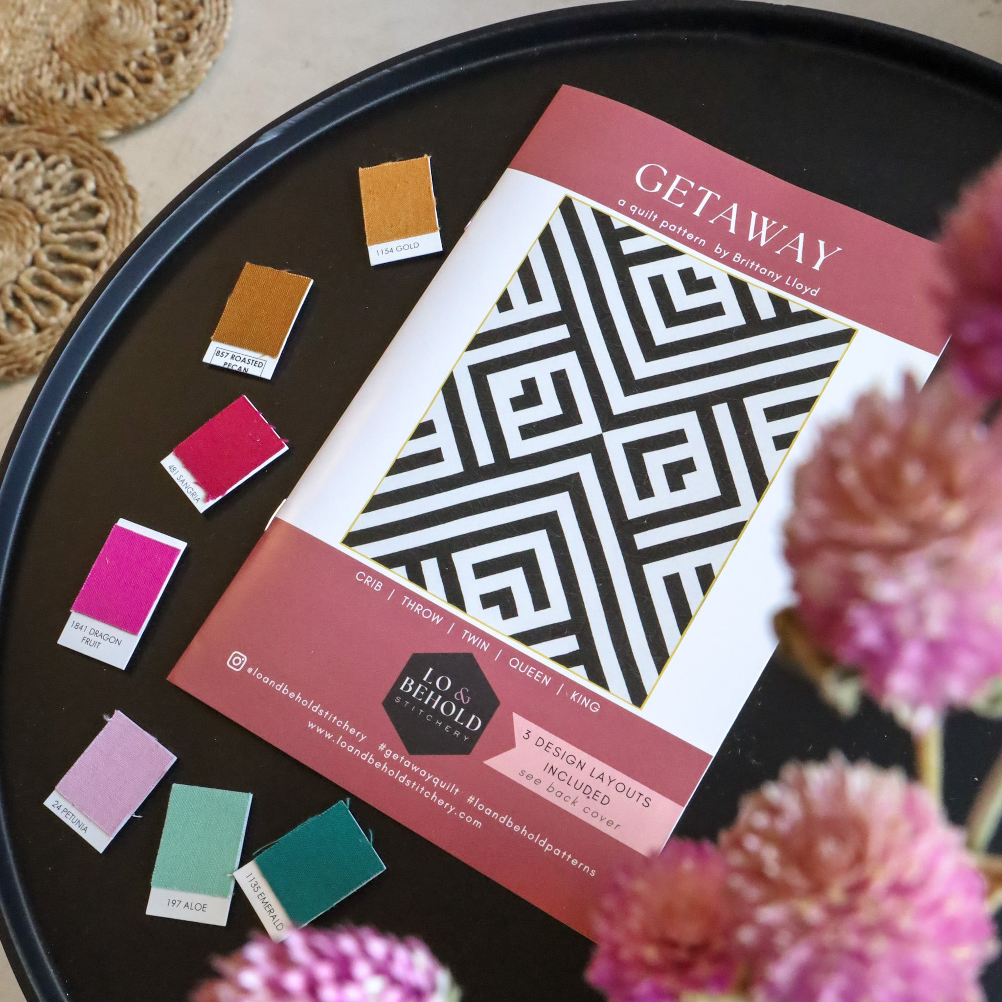
Ok now that you have a few ideas to play with, test them out to see which combinations you like best! And good news, we're excited to partner with PreQuilt again to bring you FREE digital coloring pages so that you can plan out your quilt making it easy to test out a LOT of different fabrics included pre-loaded solids fabric swatches from 12 different manufacturers.
Have fun with it and we'd love to see what colors you decide on so be sure to share! Use the hashtag #getawayquilt and #loandbeholdpatterns and tag us @loandbeholdstitchery on social media.
Happy Sewing!


